This has been bugging me for, oh I don’t know, a decade or so. I thought perhaps it was a running joke in the movie industry, like the Wilhelm Scream, but this being Hollywood it turns out it’s just an ego thing:
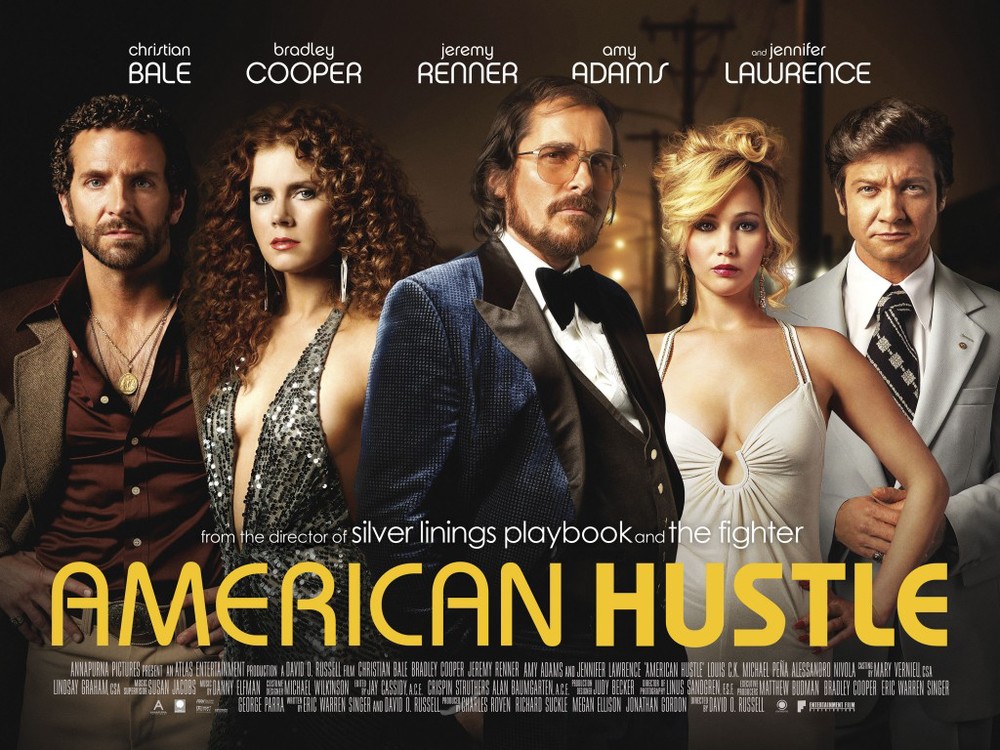
The name order is determined according to the billing order, so it’s contract-bound. The positioning of the poster elements is determined in a similar manner, except that there is no rule saying where should the actor/actress with the top billing go exactly (usually as big and centered as possible). The designers and marketing people work it out to give more prominence to the biggest actors/actresses. This is why you often see floating heads on movie posters. Prominence!
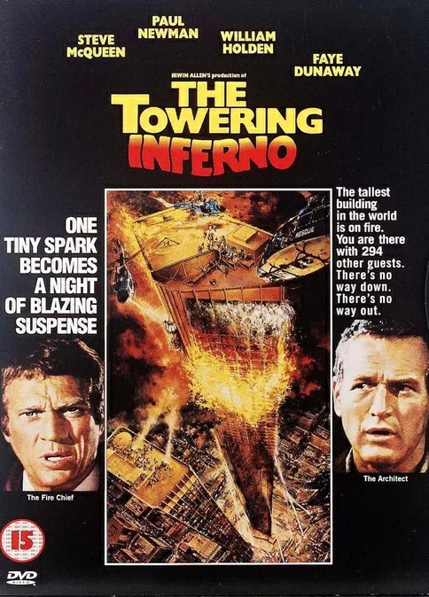
Having designed a lot of club flyers for my flatmate when I was a student, I’m familiar with the problem. Getting the lineup into the design without pissing off the big names was always the biggest headache. For the poor movie poster designer though, the problem was magnified, as this story about The Towering Inferno testifies:
Stars Paul Newman and Steve McQueen apparently argued intensely over who should get top billing. In the end the producers settled for a compromise: reading the film poster (which is reproduced as the DVD cover) top to bottom, Paul Newman is first, i.e. higher, or “top” billing. But reading left to right, Steve McQueen is first. The same applies to their photographs either side of the main artwork, McQueen on the left but Newman (marginally) higher up.
Thankfully outside of LA, the rules can be broken more easily. For example the numbering on the iconic Trainspotting poster originated from the book’s interludes — “Junk Dilemmas No. 63” — which were changed to start from No. 1 to avoid confusion:
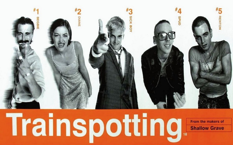
… which just leaves the question of why Renton wasn’t placed in the centre? (to keep things alphabetical).
Posted to graphic-design in 2014.